Enhancing the Mobile-Web Bike Shopping Experience 🚴♀️
Zyn: Where Power Meets Precision for the Ride of Your Life.
The Challenge: Turning Frustration into Confidence
Zyn, a brand synonymous with high-performance cycling, caters to serious cyclists who expect a seamless online shopping experience. Yet, their website was falling short—users were abandoning their carts at alarming rates, frustrated by a complicated checkout process and a lack of intuitive features.
It was clear the shopping journey needed a transformation, and I was ready to lead the charge. My mission? Simplify the experience, empower users with confidence, and ensure they left the site excited about their next ride—not empty-handed.
Process
Role: Solo UI/UX Designer and Researcher
Timeline: 1 Month
Tools: Figma, Miro

Project Plan
To stay on track within the one-month timeline, I created a project plan that outlined key milestones for each phase of the process:

Where the Journey Began: Digging into the Problem
To understand the why behind the high cart abandonment, I set out with a focused approach:
Identify the pain points in the checkout and browsing process.
Discover what features mattered most to users when comparing bikes.
Create a roadmap for a frictionless and delightful shopping journey.
Research Methods: A Deep Dive into User Needs
1. Competitive Analysis:
I analyzed leading platforms like Trek Bikes, Amazon, and Target to see what worked (and what didn’t):
Trek Bikes
Strengths:
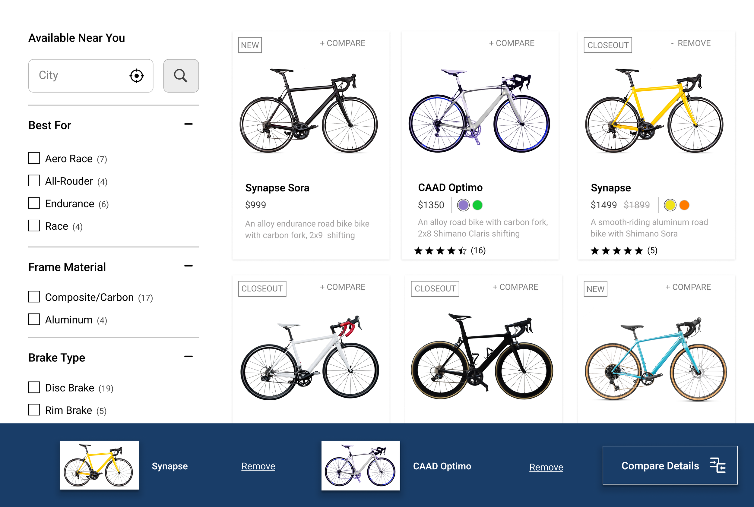
The comparison tool was a standout feature, helping users evaluate bikes easily.
Detailed product information appealed to serious cyclists.
Weaknesses:
The site was overwhelming, with hard-to-spot specs like bike weight buried in text.
No trade-in program, which would make upgrades easier.
Action Items for Zyn:
Visualize specs like weight with images (e.g., someone lifting the bike).
Introduce a trade-in option for loyal customers.

Amazon
Strengths:
Robust filters and comparison tools simplified product discovery.
Bold “Buy Now” and “Add to Cart” buttons enhanced the shopping experience.
Weaknesses:
Overwhelming detail required excessive scrolling to find key specs.
Mandatory account creation slowed down the checkout process.
Action Items for Zyn:
Keep pages clean and scannable, highlighting critical specs, pricing, and reviews.
Include a guest checkout option for faster purchasing.

Target
Strengths:
Clean layouts, simple filters, and visible CTAs created an easy shopping flow.
Guest checkout and Apple Pay made transactions seamless.
Weaknesses:
Product pages lacked depth for big-ticket items like bikes.
No comparison tools for informed decision-making.
Action Items for Zyn:
Add a side-by-side comparison tool.
Provide richer details for higher-priced products like bikes.

2. User Interviews:
I spoke with five cyclists ranging from casual riders to hardcore enthusiasts. Their insights gave me a direct line to their frustrations and needs:
Specs Matter: Weight, durability, and performance were deal-breakers.
Comparison is Key: Users wanted a way to easily evaluate bikes side by side.
Frictionless Checkout: Long forms and mandatory account creation were major turn-offs.
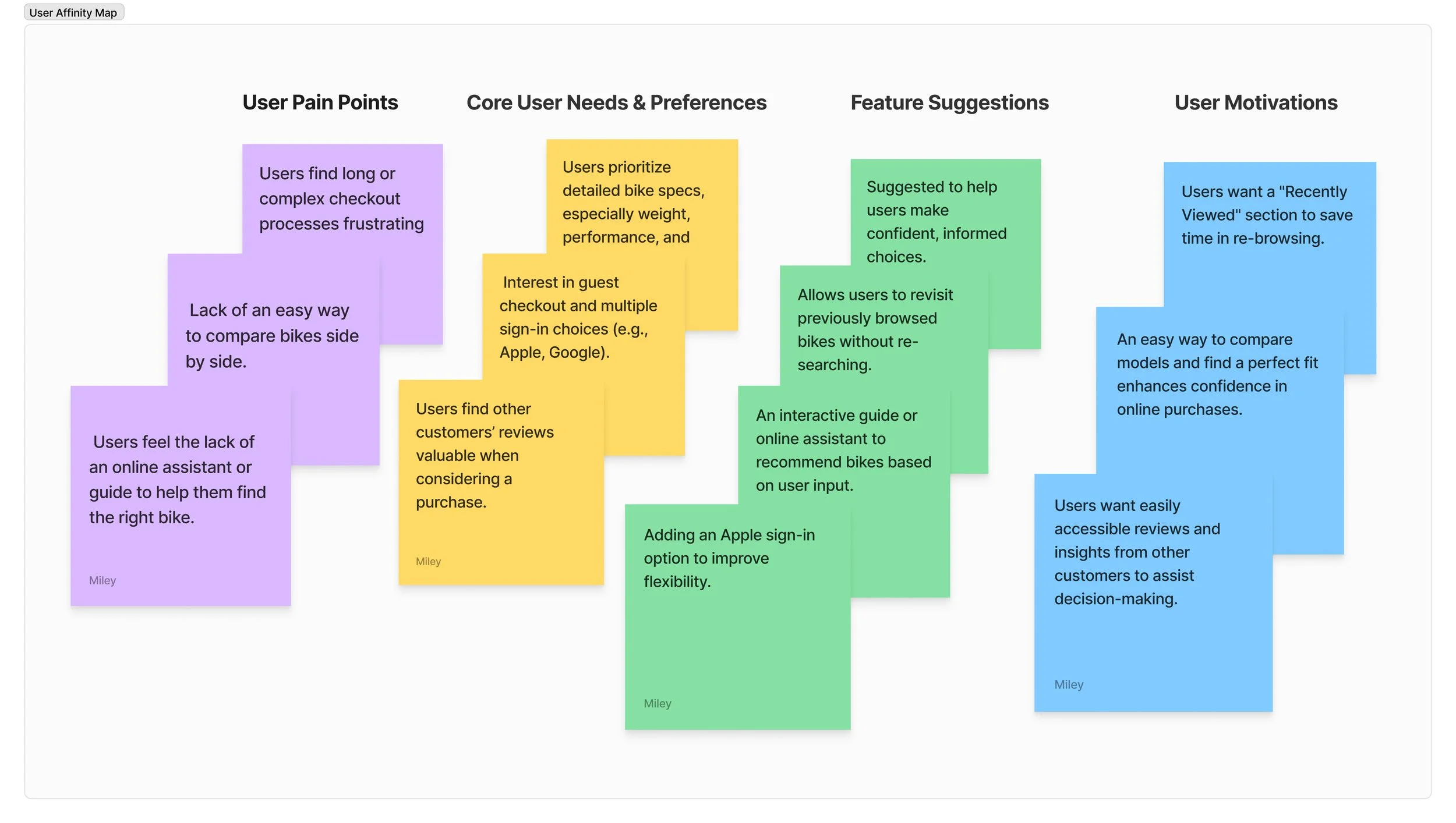
3. Affinity Mapping:
Using themes from the interviews, I organized feedback into actionable insights.
Pain Points: Long checkouts, no comparison tool, and limited product guidance.
Core Needs: Clear specs, flexible checkout, and customer reviews.
Feature Requests: Comparison tools, a “Recently Viewed” section, and a fit guide.


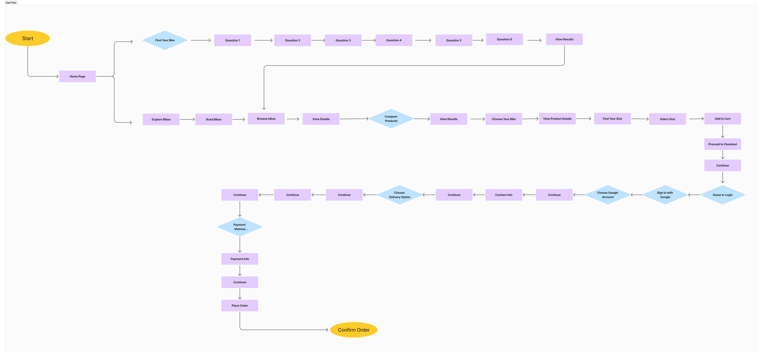
Designing for Clarity and ConfidenceMapping the User Flow
From discovery to checkout, I mapped a streamlined journey that guided users effortlessly:
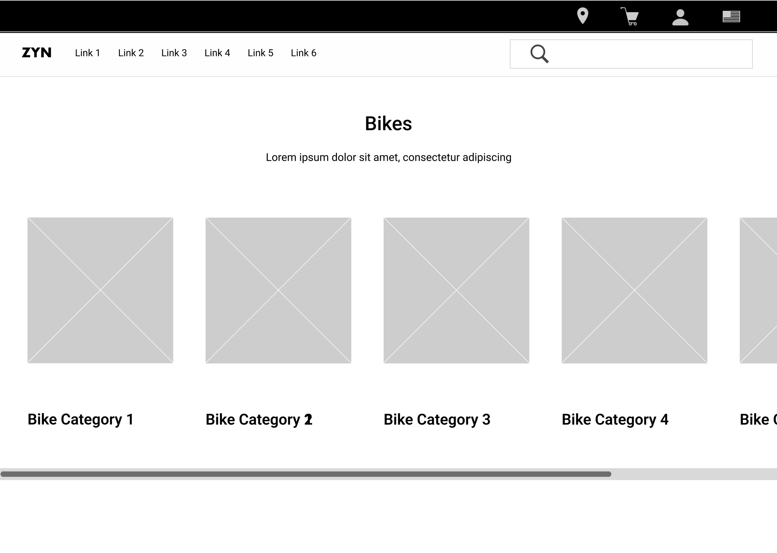
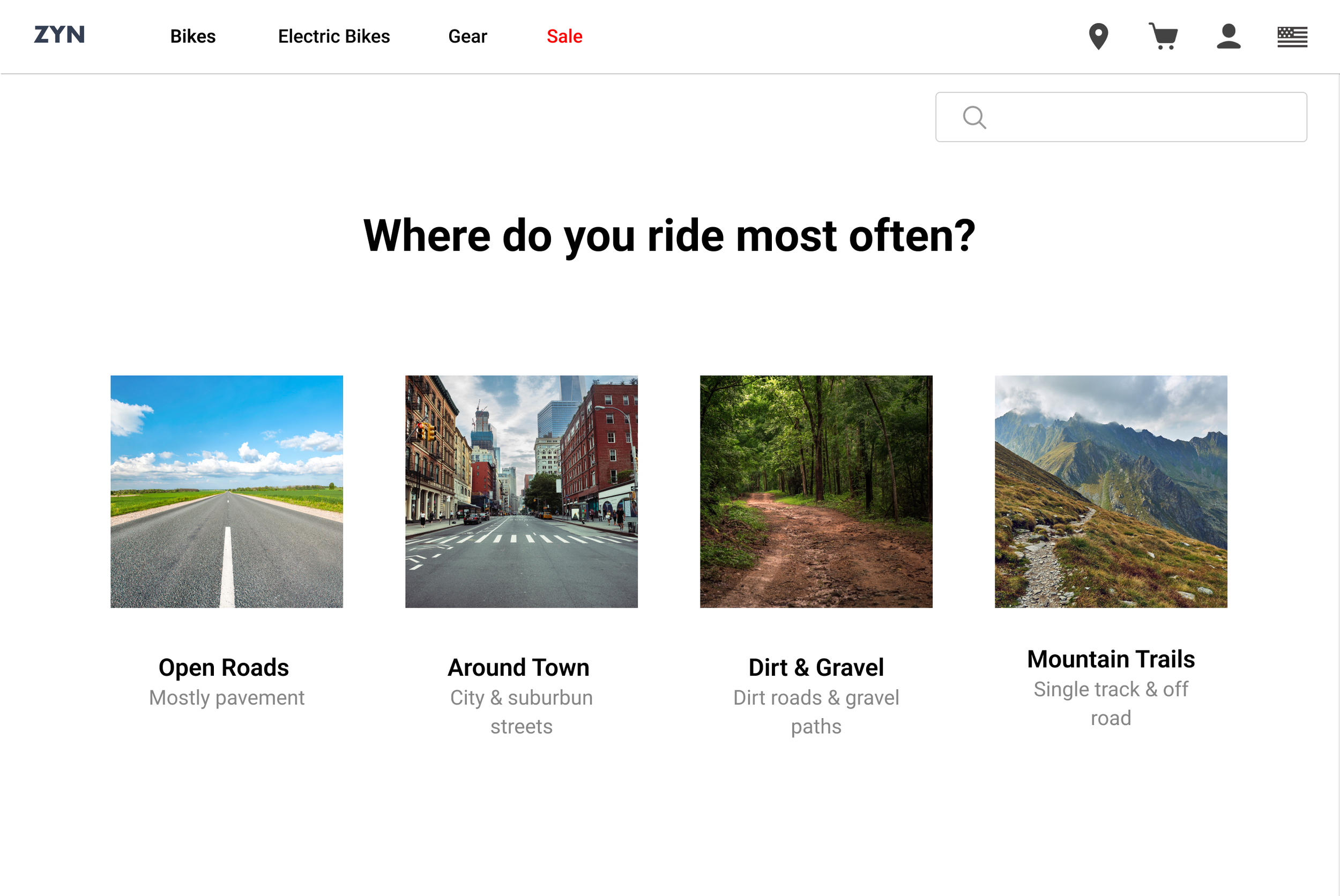
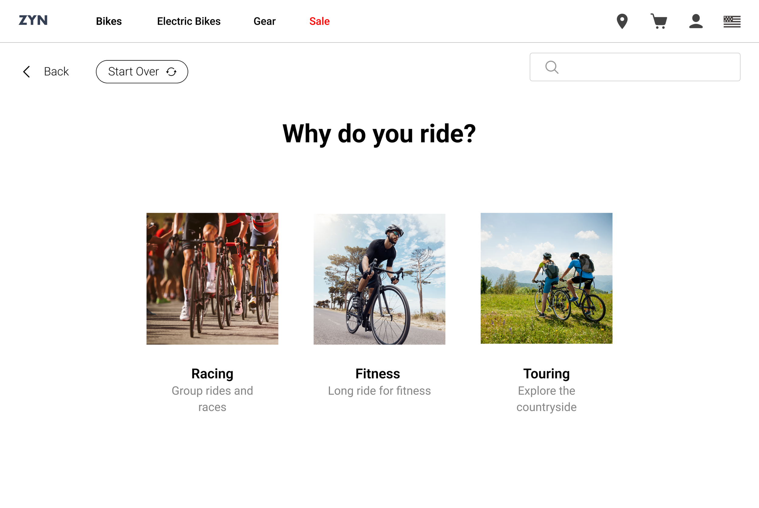
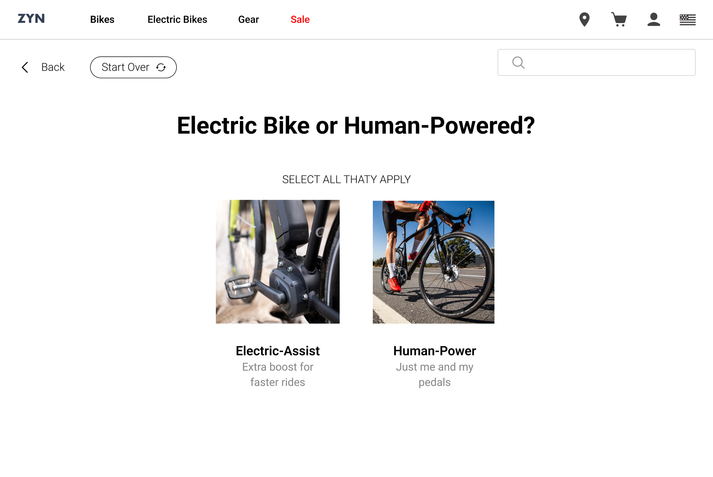
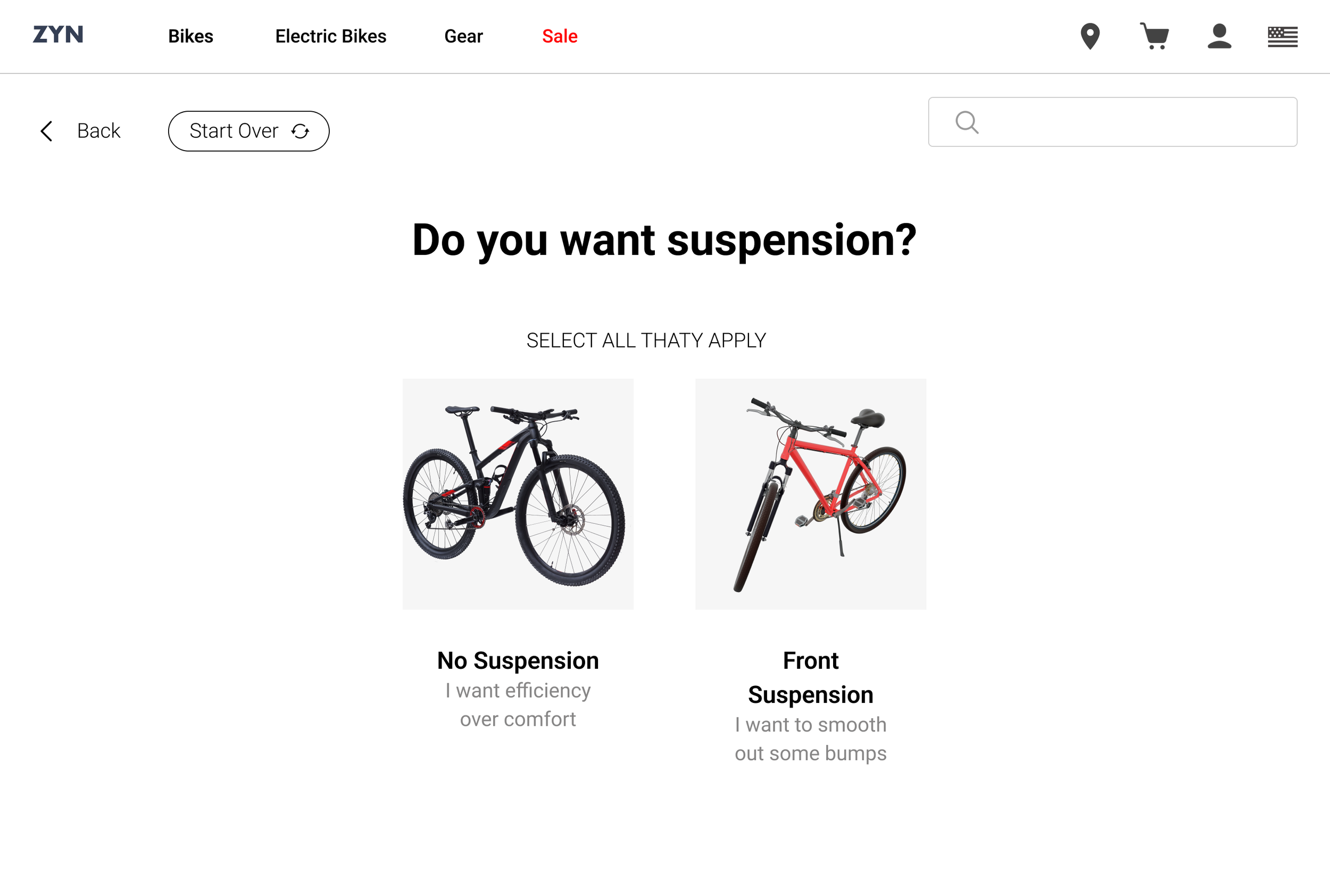
Find Your Bike: A refined catalog with filters and a bike comparison tool.
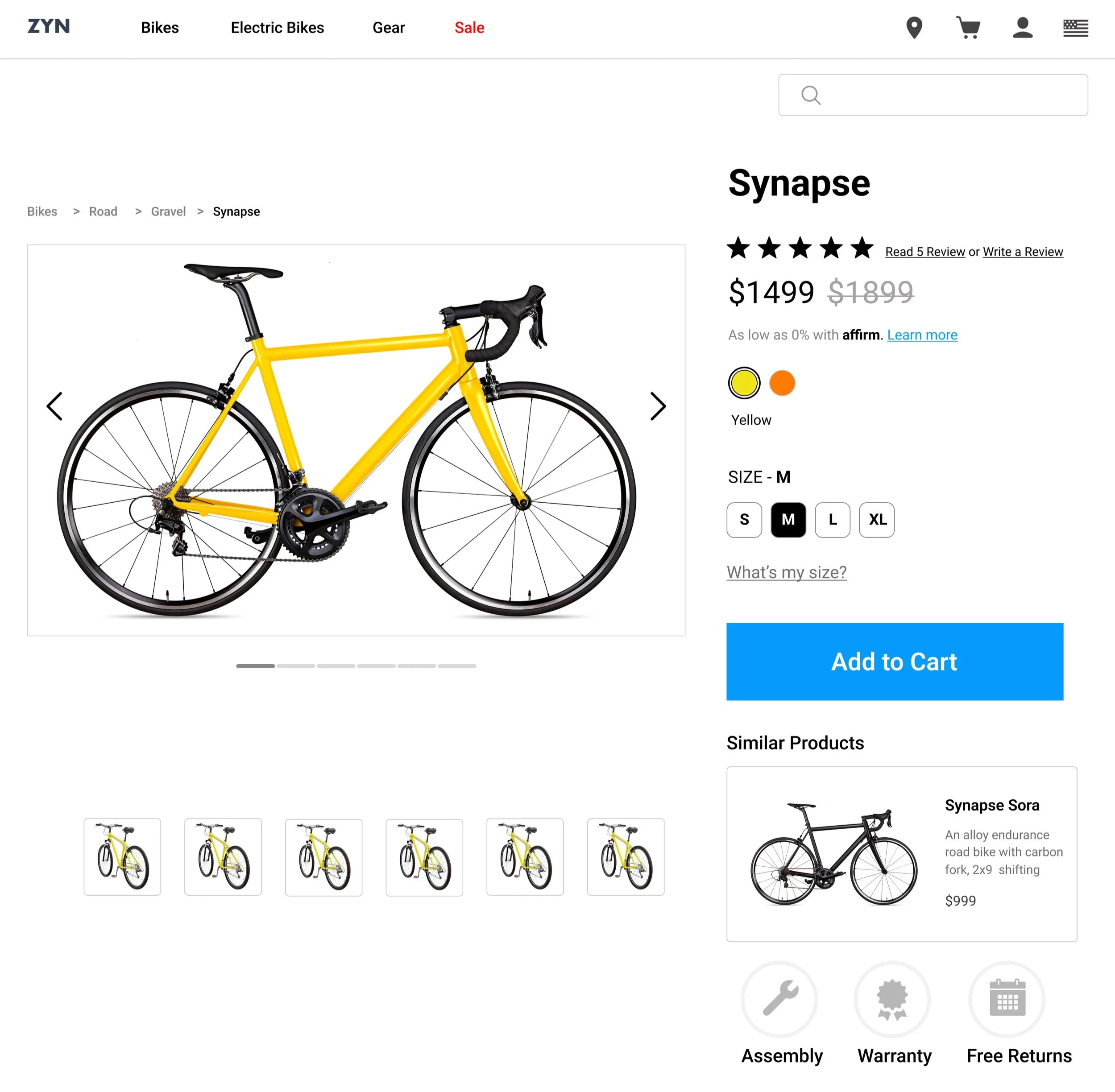
Customize Your Ride: Personalized recommendations and clear specs.
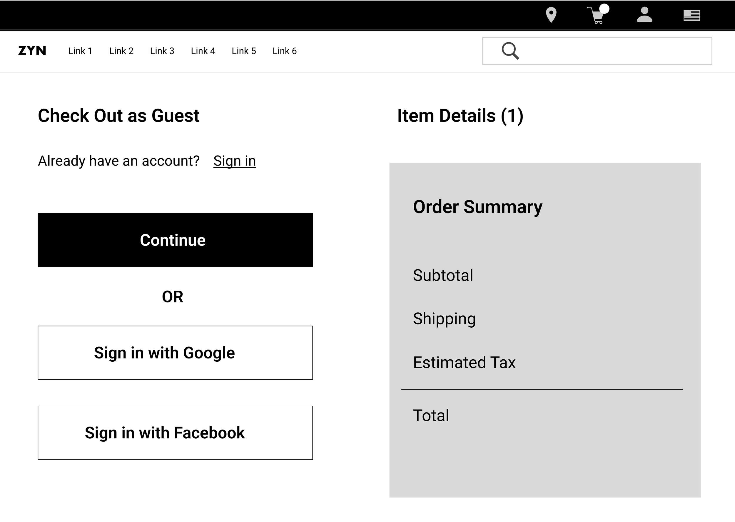
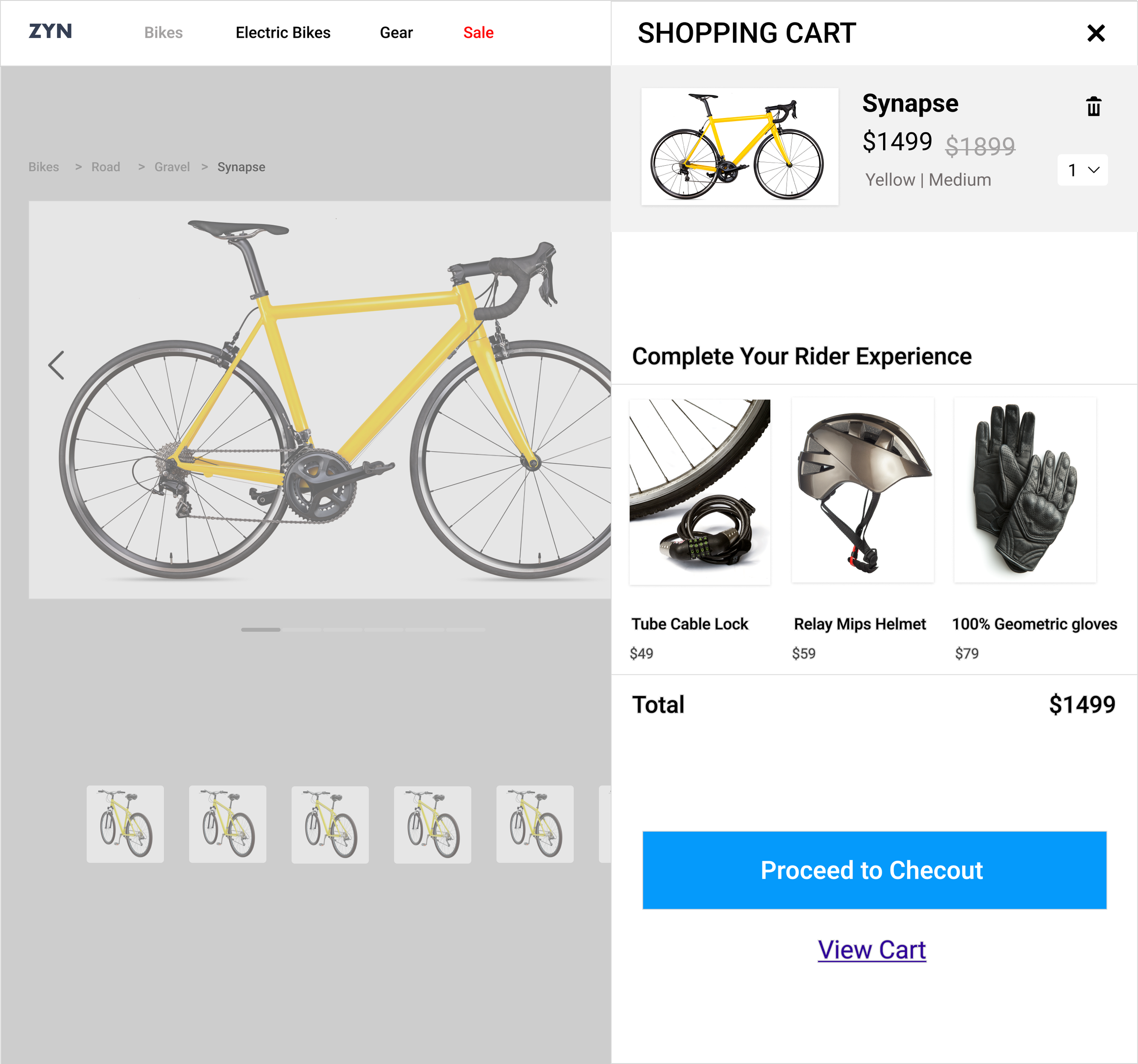
Checkout with Ease: Guest checkout options that let users skip account creation entirely.
Turning Vision into Reality: Testing and Iterating
First Round of Testing:
With a low-fidelity prototype in hand, I tested it with five users.
What Worked:
Smooth navigation from catalog to checkout.
Users loved the comparison tool but wanted weight and customer reviews included.
Guest checkout was a hit!
What Needed Tweaks:
Users requested a “Recently Viewed” section to track bikes they liked.
More visual cues for key specs like weight and performance.


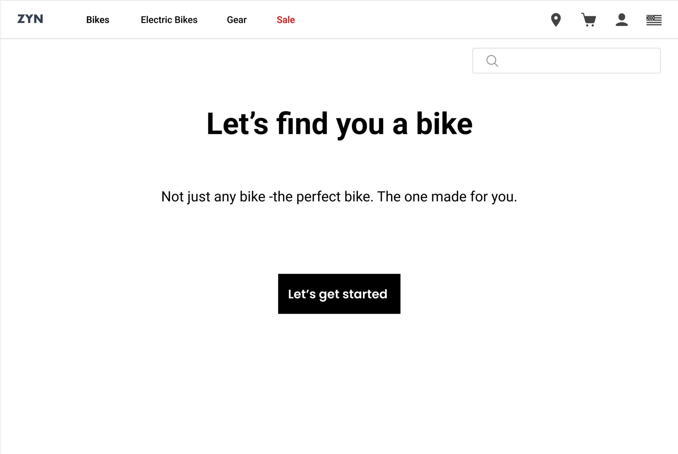


From Sketches to High-Fidelity Mockups
Incorporating feedback, I moved to high-fidelity designs:
Polished the comparison tool, adding specs and user reviews for easy evaluation.
Enhanced guest checkout with options like “Sign in with Apple.”
Created a sleek, intuitive catalog that embodied Zyn’s high-performance vibe.


Second Round of Testing:
With the updated designs, I tested again:
What Users Loved:
The comparison tool now felt indispensable.
Guest checkout options offered freedom and speed.
Recommendations:
Add a “Recently Viewed” section:

Consider an online assistant or bike-fit tool for first-time buyers:

The Results: A Streamlined Ride to Success
My design improvements significantly boosted Zyn’s performance metrics:
📈 Cart Abandonment Rate: Decreased by 35%, as users found the checkout process smoother and more intuitive.
📉 Time Spent on Site: Increased by 20%, with users engaging more deeply with product comparison tools and browsing features.
🎉 Sales Growth: Zyn saw a 25% increase in bike sales within three months of the redesign, driven by user confidence and improved decision-making tools.
📊 Guest Checkout Usage: Over 40% of buyers opted for guest checkout, highlighting its impact on reducing friction in the purchase flow.
Reflections & Next Steps
What I Learned:
Personalization builds trust. Users loved tools that catered to their specific needs.
Simplicity is key. A frictionless flow turned frustration into excitement.
Iterate and refine. Testing early and often revealed insights I couldn’t have predicted.
Looking Ahead:
Trade-In Program: Offering trade-ins to make upgrading easier and more affordable.
In-Store Tryouts: Integrating scheduling features to connect users with nearby locations for test rides.
Conclusion: Pedaling Toward a Better Experience
The Zyn project taught me the power of combining user insights with thoughtful design. By addressing frustrations and building trust, we created a journey that’s as smooth as the perfect ride.
And this is just the beginning—Zyn’s online experience is now a foundation for even more exciting possibilities. 🚴♂️