MomHive – A Community Built from the Heart
Supporting New Moms Through Postpartum Challenges
The Story Behind MomHive
Let me take you back to a pivotal moment in my life. I was six months pregnant, navigating the whirlwind of emotions, excitement, and uncertainties that come with preparing to welcome a new life. But as I planned for my baby’s arrival, a pressing thought kept surfacing: postpartum challenges. How would I handle them? And more importantly, how do other women like me find the support they need during this vulnerable phase?
This heartfelt concern became the inspiration for MomHive, my very first capstone project at Springboard. Designed during one of the most transformative periods of my life, I poured my heart into this app, treating it with the same care and attention as I would my baby. By the time I completed the project in my ninth month of pregnancy, I knew this wasn’t just another app design. It was my way of creating a meaningful solution for women stepping into motherhood.
The Problem
In my research, I uncovered a harsh reality: 85% of new moms experience feelings of isolation, loneliness, and sometimes even depression. The traditional support systems they rely on often feel fragmented, and finding reliable information or local resources can be overwhelming. What moms really needed was a one-stop platform that brought everything together—a space to connect, share experiences, access local activities, and find professional mental health resources.
Role: Solo UI/UX Designer, Researcher
The Process
Timeline: 3 Months

1. Research & Insights
Interviews & Surveys: I conducted in-depth interviews with 16 new moms and analyzed survey responses, which revealed that 85% of them felt isolated and struggled to find local connections or reliable information. Their experiences and challenges shaped the core features of MomHive.


User Personas: I created four personas representing different demographics and experiences to guide the design process


Competitive Analysis: I explored apps like Peanut, BabyCenter, and Nara to understand how they serve new moms. Peanut and BabyCenter are fantastic at focusing on baby-related content, while Nara does a great job addressing postpartum challenges. However, there’s a noticeable gap: none of these platforms offer a comprehensive, all-in-one solution that supports both the mom and her baby.
Peanut and BabyCenter excel in building online communities, but their focus remains heavily on the baby rather than the mom’s holistic needs. Nara, on the other hand, prioritizes postpartum care but lacks features for fostering real-life connections through local meetups or offering professional resources.
This gap was my “aha” moment. I envisioned Momhive as the ultimate go-to app—one that combines community, professional support, and local events, ensuring moms don’t need to juggle multiple apps to meet their needs. It’s not just about creating another app; it’s about giving moms a supportive space where they feel heard, connected, and cared for.


Image upload failure

Mapping the User Journey: With storyboards and a user story map, I visualized how moms would interact with MomHive—from signing up to joining a group for local meetups. Every interaction was designed to feel intuitive, supportive, and empowering.


2. Ideation & Early Concepts
I brainstormed features that directly addressed the challenges moms face, such as:
An online community for emotional support.
Local meetups to reduce feelings of isolation.
Access to professional resources and self-care guides.


Tools: Figma, Miro, Canva
3. Turning Ideas into Designs
Sketching and Ideation I love this phase of the process—it’s where imagination meets reality. With a pen in hand, I sketched out ideas for features like a vibrant online community, a local event calendar, and curated resources for mental health and parenting tips. These sketches became the seeds of a cohesive design.

Affinity Mapping: I organized interview insights to identify common themes, such as the need for group chats, mental health resources, and event calendars.


Site Map & User Flow: Next, I planned the app’s structure and user flows. I wanted navigation to feel seamless, so every step was carefully thought out.


Moodboard & Style Guide: I chose soft, calming colors like pastel peach and beige to create a comforting tone, while clean typography ensured readability for sleep-deprived moms. Then, I built a style guide to ensure visual consistency across all screens.

Edge Cases: I identified and planned for three edge cases: image upload failure, offline access, and limited storage space. This ensured that the app could handle unusual but important scenarios effectively.
4. Wireframes to High-Fidelity Mockups: Bringing the Design to Life
Once I had a clear structure in place, I began creating wireframes to map out the layout and interactions for each screen. This was a crucial step in visualizing the app before jumping into high-fidelity designs.
When I transitioned to high-fidelity mockups, I paid close attention to making sure the app was not only functional but beautiful. The final design featured key screens like:
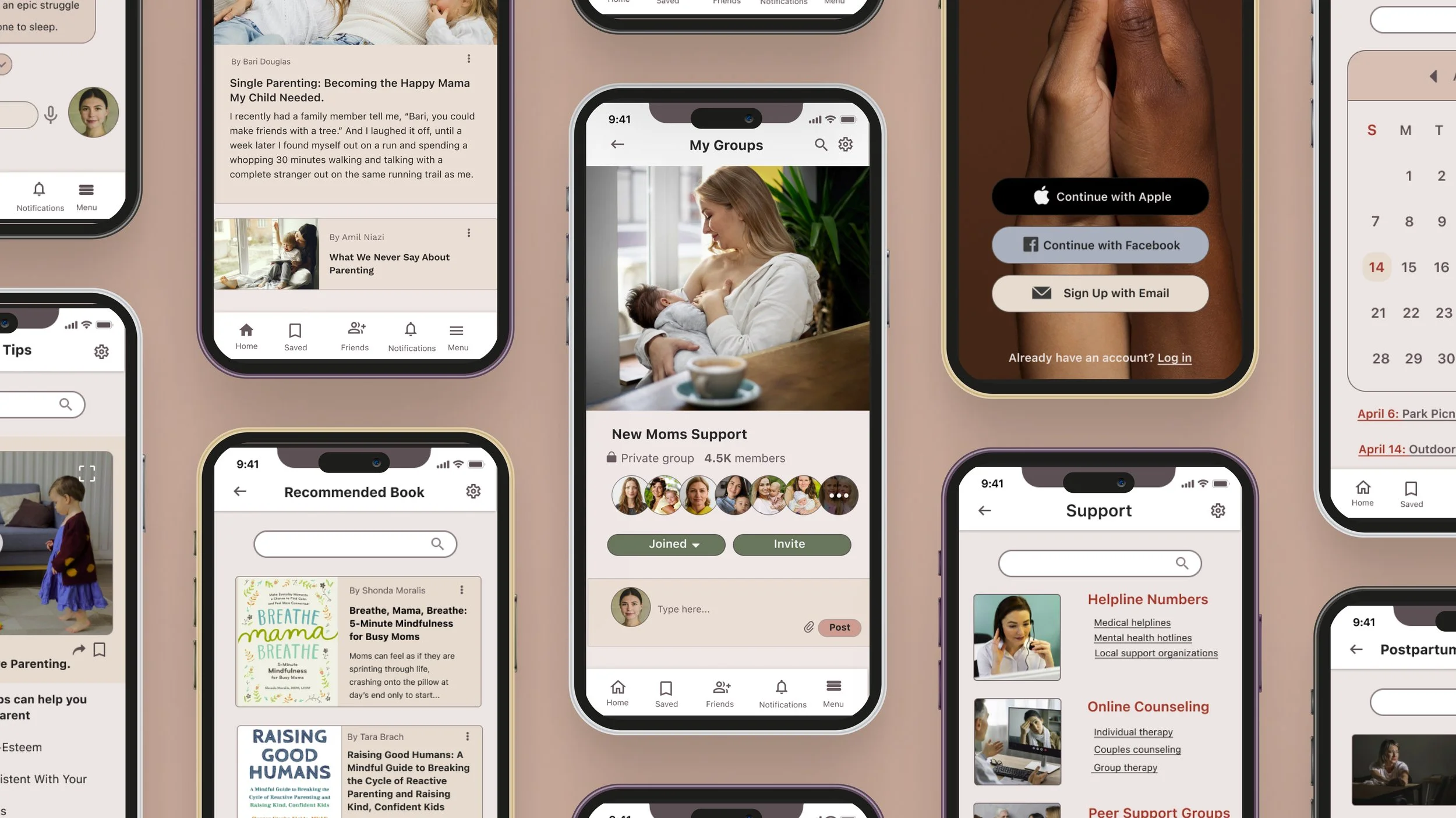
The Home Screen: A place for moms to share experiences, discover trending news, and find local events.
The Community Screen: Where moms could join groups, chat in real-time, and organize meetups in their area.
The Resources Screen: An area filled with helpful articles, books, and self-care guides—reminding moms to take care of themselves too.

Offline access

Limited storage space


5. Prototyping and Testing: Refining the Experience
Once the wireframes were ready, I brought them to life in Figma with high-fidelity mockups. Then, I created an interactive prototype to test with real users. This step was crucial—it showed me what was working and where improvements were needed.

Usability Testing: Listening to the Users
I ran usability tests with four users over two rounds. Here’s what I learned (and how I fixed it):
Finding Nearby Friends
Before: Users struggled to connect with moms nearby.
Solution: I introduced a "Find Friends" feature that uses location data to suggest nearby moms.
Impact: Engagement went up by 35%, and connections increased by 25%.

Attachment Features in Chat Rooms
Before: Users wanted to share photos in chats, but there was no option.
Solution: I added an attachment feature for sharing images and files.
Impact: User satisfaction soared, with 80% giving positive feedback.

Key Features
Home Screen:
Feed: A space for moms to share posts, photos, and experiences, fostering a sense of community.
Trending Section: Highlights popular articles, events, and local activities, making it easy for users to stay informed.
Community Screen:
Groups & Chatrooms: Moms can join interest-based groups, such as "First-Time Moms" or "Breastfeeding Tips," and participate in real-time conversations.
Meetup Calendar: A simplified way to schedule and track local events, helping moms connect in person.
Resources Screen:
Expert-curated articles on postpartum mental health, self-care, and parenting tips.
A curated library of recommended books for deeper learning, addressing diverse topics like baby sleep patterns and managing stress.
Success Metrics
The impact of MomHive, even in its prototype stage, was undeniable:
🎊 The "Find Friends Nearby" feature increased engagement by 35%, leading to a 25% boost in new connections among users.
🎉 Adding media-sharing capabilities in chatrooms improved user satisfaction by 80%, with moms spending significantly more time engaging in group conversations.
Tools Used: The Right Tools for the Job
Throughout the process, I relied heavily on tools like Figma for wireframes, high-fidelity mockups, and prototypes, and Miro for organizing research and brainstorming. These tools allowed me to work efficiently and keep everything organized.
Reflection: A Journey of Growth
Working on MomHive was deeply personal and transformative. As both a designer and a soon-to-be mom, I gained a profound appreciation for user-centered design and the power of empathy in creating impactful solutions. This project taught me the importance of listening to real users and iterating based on their feedback.
Moving forward, I plan to refine the app further by:
Expanding the network of professional support, such as lactation consultants and therapists.
Exploring integrations with wearable devices to track postpartum health metrics.
Simplifying the navigation bar even further and reducing the number of tabs to make it easier for moms to find what they need quickly.
Adding a shopping option where users can browse the best baby products, recommended by other moms based on their experiences and reviews.
While some of these ideas couldn't be implemented within the project timeline, they are areas I’m excited to explore in the future to enhance the app’s usability and value.
Conclusion and Next Steps
MomHive isn’t just an app; it’s a community built from the heart. By addressing the emotional and practical needs of new moms, it has the potential to transform how women experience motherhood. Designing this app not only sharpened my skills but also allowed me to create something that could make a real difference in people’s lives. And that, to me, is the true essence of being a UX designer.